Introduction
One of my favorite features of TotalAgility is that building an user interface is dead simple – dragging controls and making them reactive with actions rarely takes longer than just a few minutes. Here are a few tips on how you can improve the process even further.
Use the Available Space
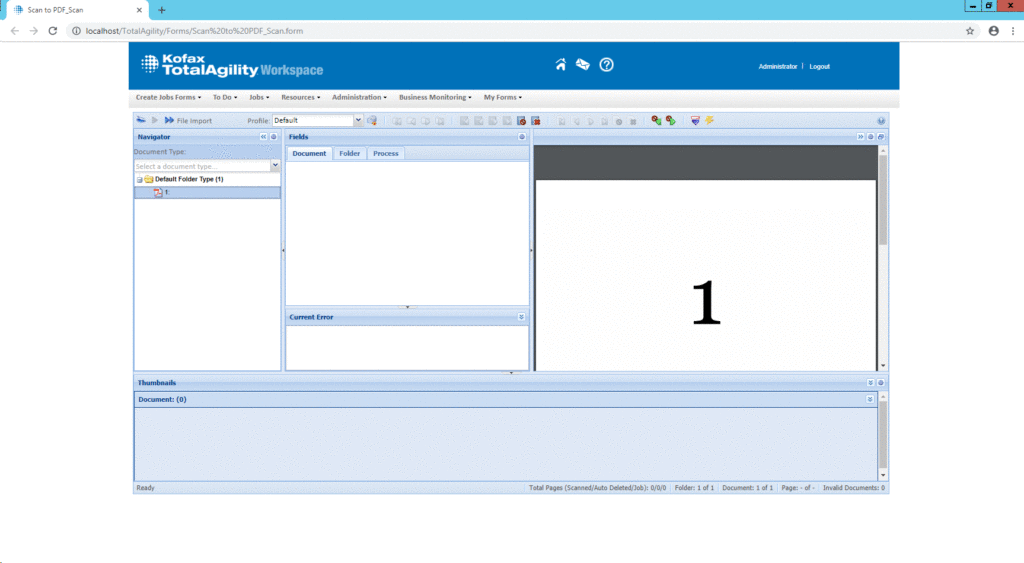
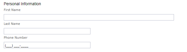
Building your web site with a max width of 960px is great for a blog or even a simple form – but less than ideal if you think of a Validation form where fields are displayed alongside the image. One of the quick wins is to use all of the available space, especially when working with MCC-enabled processes. Take the default Scan/Create New Job form or the one associated with a Take Activity – Validation: especially when a lot of fields are involved, not having your users scrolling all the time will improve their overall experience.
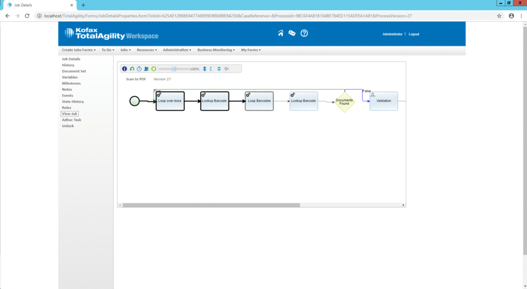
Note that we tend to optimize forms for users, but rarely administrators or even ourselves – take a look at the default View Job form. I don’t know who came up with this default size, but fortunately everything in KTA is a form – meaning that it can be changed. Here’s an example where I had the parent form take 95% of the screen’s width, and increased the width of the job viewer as well – just wide enough to show the process as a whole, not requiring me to scroll all the time.
Use a Grid Layout
Another thing that is quite common for most front-end frameworks are grid systems. Here’s a good example of a 960px grid system in action.
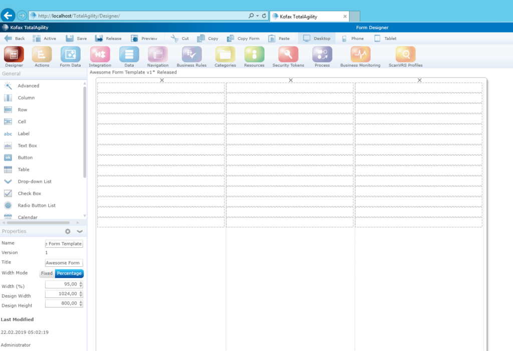
A grid will give you a lot of flexibility, especially when working with mixed content such as text, images, and for example the web viewer component. Here is an example for a form that uses a grid template – with a total width of 95% of the screen and three column at 33.3% width each.
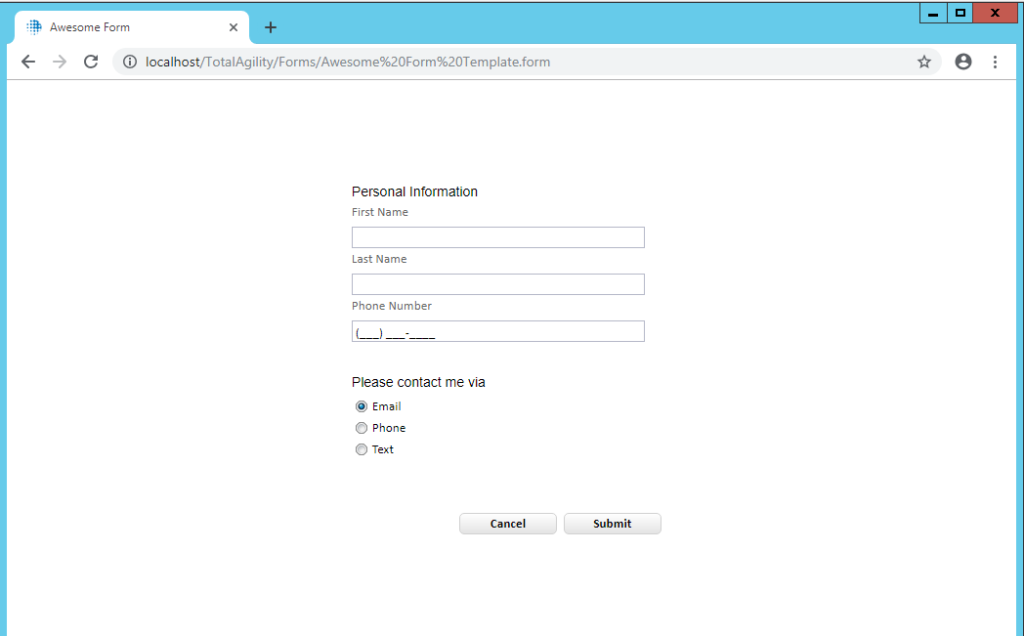
The grid can be used to quickly move controls around as needed – imagine that we want to change the layout to a simplistic form without any header/footer:
Mix Fixed and Relative Width
When switching to relative width, KTA unfortunately uses relative widths for controls places within containers. Most of the time this isn’t what you want – take the following example. First Name has a relative width of 100% while Last Name uses a 300pixels, fixed.
Form Conventions And Consistency
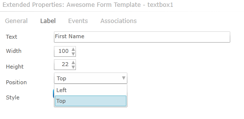
This seems like a no-brainer, yet I’ve seen all mixed versions and approaches within the same KTA tenant – first, make sure that everyone agrees on a convention. Form design principles aren’t my main objective here, so I’ll just leave this article by Google here that explains why simple is better. The important message is – make sure all your designers use the same conventions – for example: all text box controls must have their label on top of them, and they must use 100% of the width in a three-column layout (or 300 pixels maximum, et cetera).
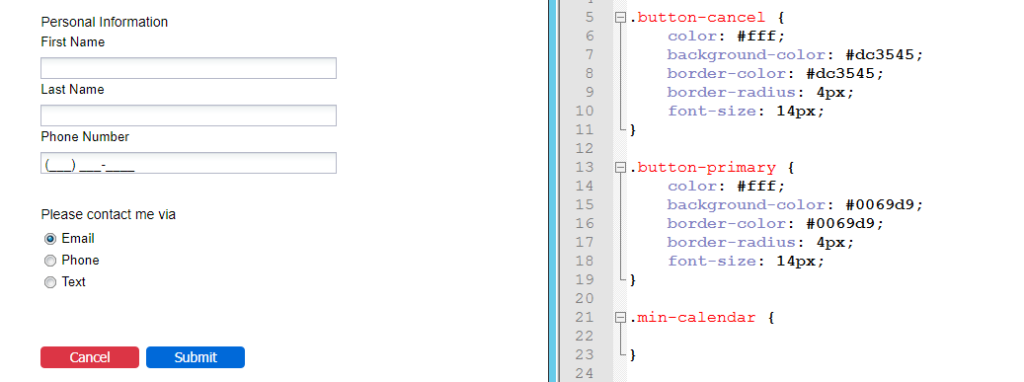
The same applies to colors – decide on primary and secondary colors. The following form uses custom CSS with buttons inspired by bootstrap:
JavaScript and jQuery
Just like most web applications nowadays KTA ships with jQuery – a powerful tool to parse and interact with the Document Object Model (DOM). If you want more interactivity, custom controls, or just change data on the fly – JavaScript is the way to go. jQuery adds a plethora of features, and makes your code more readable in general:
// selecting an input by name, getting its value
// no jQuery
var x = document.getElementsByTagName("input")["A"].value;
// jQuery
var x = $("input[name='A']").val();
There’s a (terribly outdated) Google Doc I wrote a few months back about JavaScript in TotalAgility that still shows the general idea and what’s possible.
Conclusion
This article presented just some ideas that allow you to beef up forms in TotalAgility. What’s your secret? I’d love to hear about it.